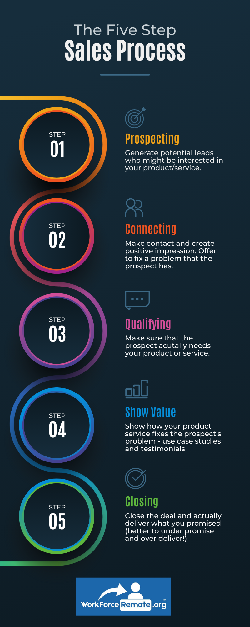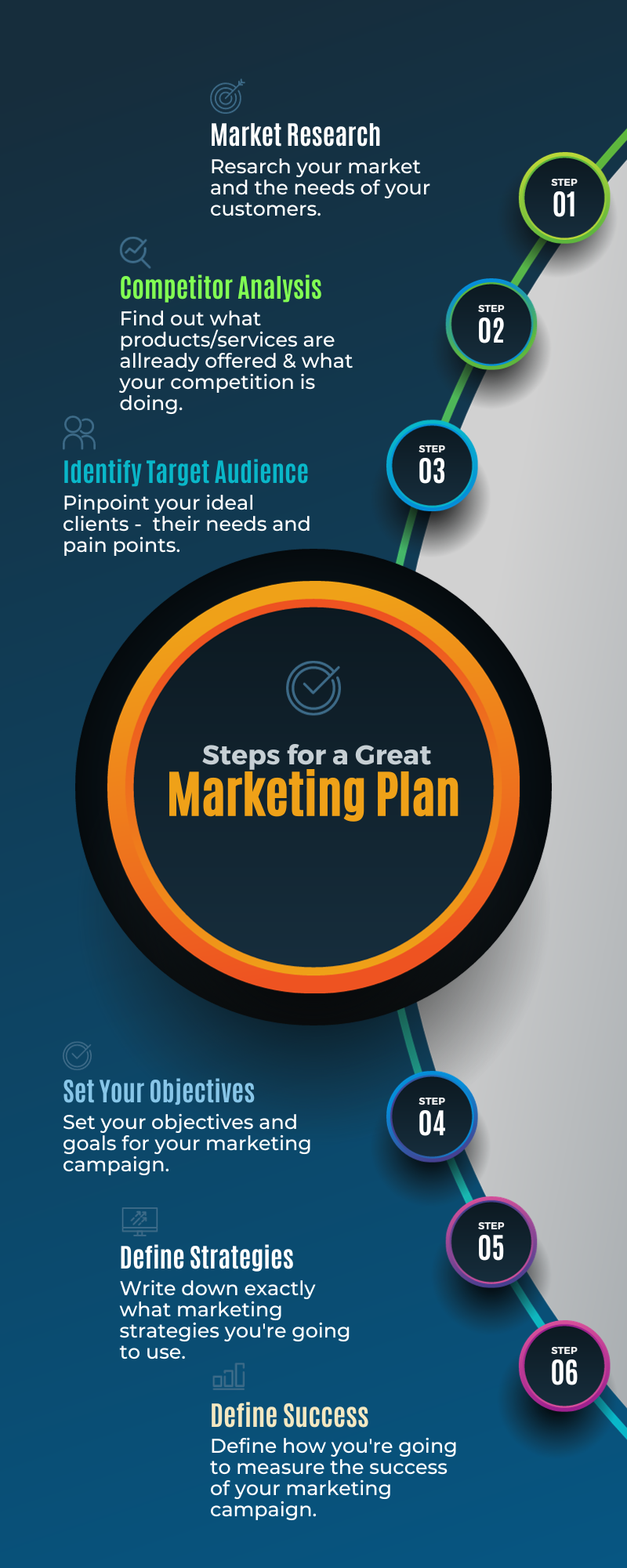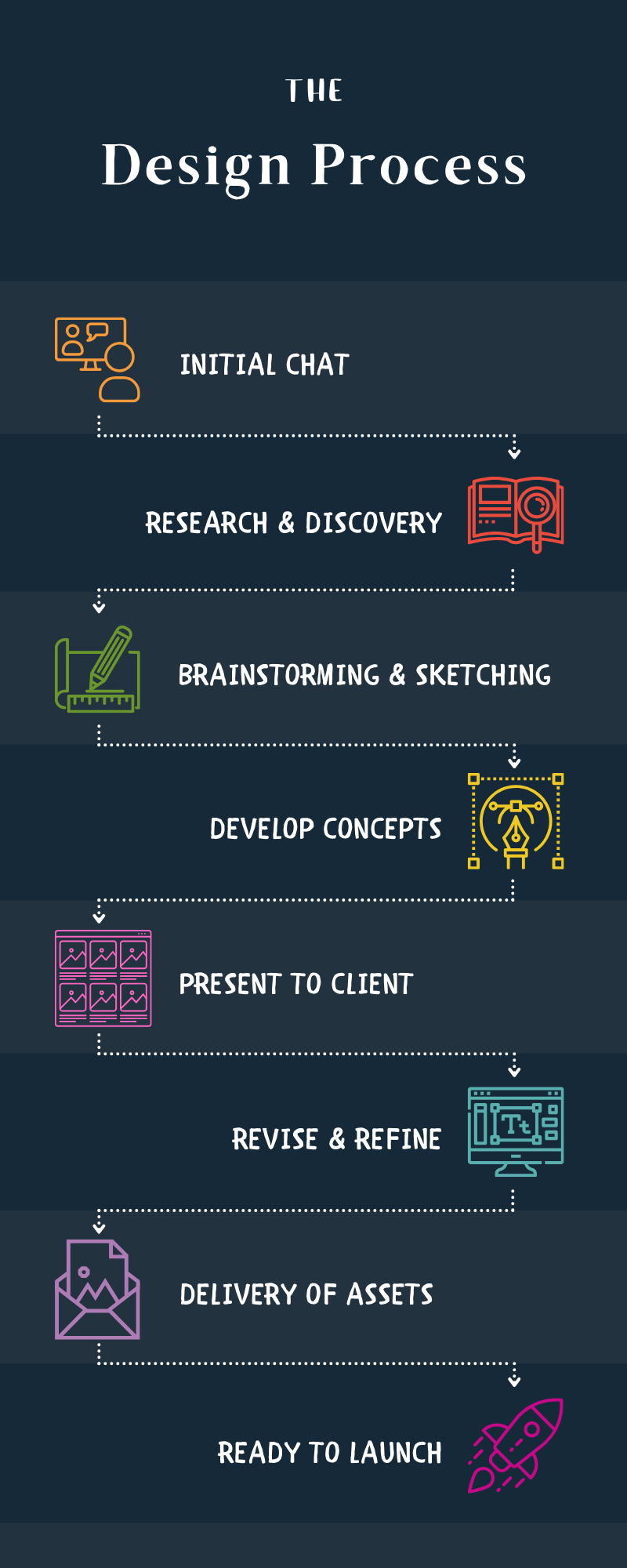
Automated Credentialing & Compliance Engine
The Problem It Solves
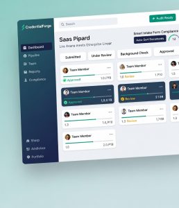
The Solution: CredentialForge
How It Works
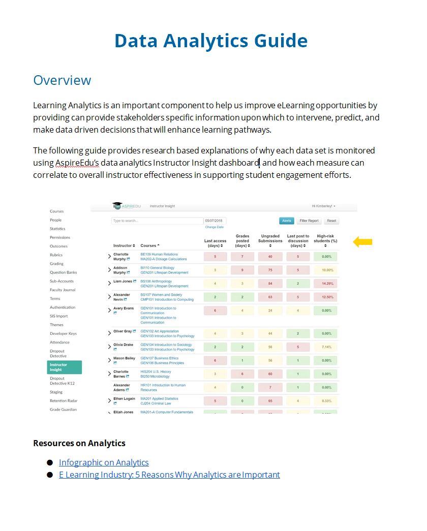
Custom Forms & Auto-Sorting to equip team members submit credentials in one location; the system instantly categorizes documents, flags missing items, and routes them to the right reviewer.
Embedded PM Tool Pipeline so everyone sees exactly where each person is in the process (Submitted → Under Review → Approved → Licensed) with automated reminders and escalation alerts.
Automatic checks against state requirements, version control for documents, and instant audit-ready reports.
Open Badge & Certificate Integration to automatically update issues digital credentials and CEUs upon successful completion.
Use Case
It eliminated temporary staffing needs, slashed manual work by over 70%, reduced processing time by weeks, and delivered audit-ready documentation.
Tech Stack
Website+Editor with Notes for lightening speed prototyping
Project Management Tool (pipeline & automation)
Open badge plugin
Custom forms & workflow tools
Cool Secret Sauce to Tie it Together
Curious yet?
Project
Redesigned the Asana workflow for 80+ field technicians at an IT installation company serving HOAs and multi-dwelling units (MDUs).
Problem
Techs hated the project management tool, too many fields, clunky mobile view, endless scrolling. Not recording important key data sets while installing tech equipment. They skipped entries or guessed data, leading to 40% incomplete records. Office staff chased missing info; installs delayed 2–3 days; clients complained.
Discovery:
Observed 10 techs on-site (real jobs): saw them fumble on phones, abandon forms mid-entry.
Pulled Asana logs: 62% fields left blank.
NPS from techs: 2.9/10 (“This app makes me want to quit”).
Client feedback: “Installs take forever—where’s the data?”
Approach
Mapped the real flow: “Arrive → install → document → leave.”
Built mobile-first prototype in Figma: one-screen dashboard—big buttons, 2-click entry for key fields (e.g., “Unit Done,” “Issue Fixed”).
Tested with 5 techs in parking lots and video calls.
Implementation
Rolled out via 10-minute mobile sessions—no PowerPoint, just “try this.”
Integrated with office dashboard: real-time updates, no manual follow-up.
Results
Recording time: Down 60% (from 12 minutes to 5).
Complete records: Up from 58% to 94%.
Tech NPS: 8.2/10 (“Finally, something that works”).
Install delays: Cut 2 days—clients happier.
Office efficiency: 70% less chasing data.
Takeaway
Tools fail when they ignore the user. Make it fast, obvious, mobile, people use it. Data flows. Everyone wins.
Scope
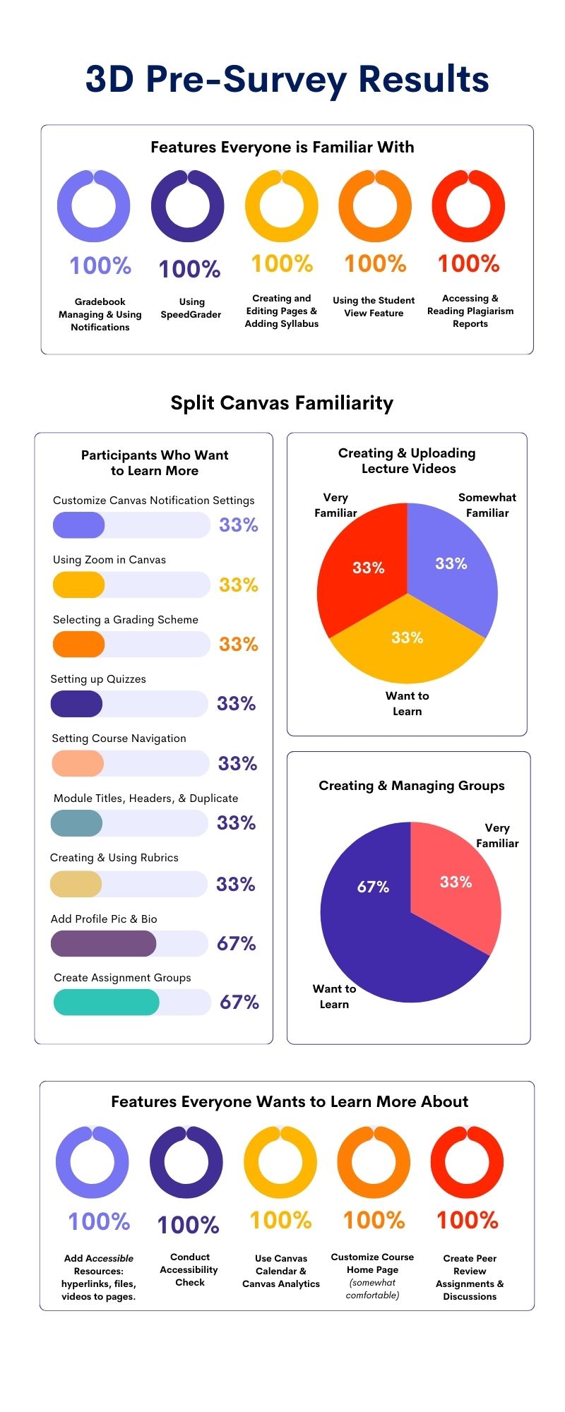
Designed and rolled out a 3D interactive training template for 200+ faculty across a university’s online programs. Goal was to stop student dropouts caused by disengaged instructors.
Problem
After a full audit, we found 42% of students dropped out in weeks 3–6. Faculty were lecturing via video—read slides, post quizzes, vanish. No check-ins, no feedback, no “are you stuck?”
Discovery Phase (Metrics We Used)
Dropout rates by week: spiked at 3–6.
Forum activity: <5 posts per course—students ghosted.
NPS from students: 3.8/10 (“instructor never responded”).
Faculty self-reports: 68% said “I don’t know how to engage online.”
Support tickets: 1,200+ “where’s my grade?” or “I feel ignored.”
Time-on-task data: Faculty averaged 2 hours/course/week—mostly grading, not interacting.
Approach
Mapped faculty journeys: “prep → teach → grade → repeat.” Found the gap: faculty did not understand expectations for course facilitation. Not trained on tools for real-time engagement.
Built a 3D template in no-code (ThingLink + Canva 3D): virtual “classroom” where faculty drag/drop interaction points—poll here, chat there, nudge at 48 hours. How to use Canvas LMS and engage student lessons/guides/resources.
Required onboarding training
Tested: 15 faculty in 30-minute sessions. Watched them fumble, iterated: added one-click “student check-in” button.
Implementation
Rolled out mandatory 2-hour workshop: faculty built their own 3D template.
Added AI prompts: “If no reply in 24h, send: ‘Hey, saw you logged in. Need help?'”
Made it mobile-first: faculty could preview on phone, realistic for adjuncts.
Results (Tracked Ongoing)
Dropout rate: Down 31% (from 42% to 11%).
Forum posts: Up 300% (average 15/course).
Student NPS: 7.9/10 (“Instructor actually cares”).
Faculty engagement time: 7 hours/week—now includes live chats.
Ticket drop: 88% less “ignored” complaints.
Retention metric: 89% course completion (up from 58%).
Faculty weren’t lazy, they were lost. Give them a tool that feels like a classroom, not a checklist, and they engage. Students stay because someone sees them.
Scope of Project
Redesigned a 2,000-employee onboarding platform for a mid-size logistics firm (remote-heavy, multi-role users).
Pain Points
New hires dropped out at 35%, they got lost in 40-page PDFs, confusing dashboards, and no clear “next step.” HR blamed “lazy users.”
My Role
UX Director (hired as “training lead,” but I owned the redesign).
Approach
Mixed methods. Watched 12 new hires in real-time (screen shares), ran 5-minute usability tests, pulled data from LMS logs (drop-off points).
Mapped journeys. Found 80% of pain at “choose role” screen—too many options, no preview.
Prototyped fast: Paper sketches → Figma wireframes → no-code test in Bubble (drag-and-drop roles, visual previews).Simplified flow. 3-click onboarding (role → goals → first task).
Added AI nudge: “You’re 70% done—finish this to unlock your schedule.”
Plain language. Swapped title “compliance module” for “What you need to know before day one.”
Results
Completion rate 87% (up from 65%).
Support tickets Down 92% (no more “I can’t find my badge”).
Training isn’t content, it’s experience. When you stop forcing people to learn and start letting them do, they stay.
My Role. UX Research & Design Lead
Scope. Platform serving 20,000+ global users across higher ed, corporate, and public sectors
The Challenge. Users faced inconsistent navigation, overwhelming content density, and poor personalization, leading to low engagement and high drop-off during onboarding and course progression.
My Approach & Steps
Step 1: Discovery & Research
Conducted 45+ user interviews and 30 usability sessions with diverse learners (students, professionals, admins).
Created user personas and journey maps to visualize pain points across lifecycles.
Performed heuristic evaluation against WCAG 2.2 and Nielsen’s usability principles.
Step 2: Synthesis & Prioritization
Analyzed qualitative/quantitative data to identify top friction areas (e.g., search, dashboard clutter, mobile responsiveness).
Prioritized issues using impact-effort matrix; aligned findings with business goals (adoption, satisfaction).
Step 3: Design & Iteration
Developed low-fidelity wireframes and prototypes in Figma/Canva.
Ran A/B tests on navigation patterns and personalized dashboard layouts.
Incorporated micro-interactions and gamification elements for engagement.
Step 4: Validation & Refinement
Facilitated iterative testing rounds with 15–20 users per cycle.
Used feedback to refine interfaces, ensuring WCAG compliance and cross-device consistency.
Step 5: Implementation & Measurement
Collaborated with dev and product teams to launch redesigned experience.
Tracked post-launch metrics via analytics and follow-up surveys.
Step 6: Measured Outcomes
25% increase in user satisfaction scores
Faster task completion (reduced onboarding time by ~30%)
Improved retention through clearer, more intuitive pathways
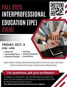
Partnered with chairs across programs to design and implement a Canvas LMS course serving as a multi-program professional development training hub for students across various degree programs. Coordinating with department chairs from multiple disciplines, I developed the Interprofessional Education (IPE) Hub, which integrated Zoom-based meetings with a comprehensive Canvas course compendium.
This initiative automated the previously biannual training sessions, transitioning them to a paperless format with automated signups, while incorporating digital credentials to recognize participant achievements.
The result fostered interdisciplinary collaboration, streamlined administrative processes, and provided a centralized resource for ongoing professional growth and skill-building.
Asana HR Automation: The Dashboard That Solved Time Off Issues
The riddle. They had PTO requests, manager approvals, anniversary tracking, paid vs unpaid hours—and one cranky spreadsheet that nobody trusted.
The rule. No new tools. No budget. Use what we already pay for.
The fix. In four days, I built a closed-loop system inside Asana.
Custom fields for balance, type, hours.
Rules for automations.
A single intake form that routes to the right approver based on role.
Automated status boards—pending, approved, rejected—visible to Managers
Dashboard tiles that pull real-time totals so no one ever asks, “How many days do I have?” again.
Rules engine that flags expired requests, birthday extensions, and FMLA overlaps before they happen.
Result. Zero emails. Zero missed approvals. Zero IT tickets.
Side-effect. Managers now see the ‘Time Off Calendar’ tile on the same board. One glance: who’s out, who’s half-day, who’s in. Project leads stopped double-booking. Installations now ship on time instead of ‘someone called in sick.’
At a west coast university, I spearheaded a large-scale initiative to develop a comprehensive online, asynchronous Spanish-language program for the Master of Divinity degree in the School of Theology.
This project addressed accreditation mandates and the university’s strategic goal to engage the Hispanic community by creating an innovative online curriculum (15 courses) from scratch, overcoming the lack of existing Spanish courses through collaborative templates (Design Docs) to develop the course content offline (learning materials, media, assessments, rubrics, and faculty training), creating a Canvas LMS template for course consistency, AI-assisted tools, and structured project management to ensure timely launches and cultural sensitivity.
To overcome significant language barriers, where I did not speak Spanish and some faculty were not fluent in English.
I helped create a mediated process leveraging the department chair as a facilitator for clear communication and content exchange, enabling seamless collaboration; this allowed me to build and deploy the courses using Canvas LMS while leveraging AI tools to develop rubrics aligned with course assignments and to translate Spanish syllabi and content, ensuring accurate implementation and high-quality builds.
This large-scale initiative successfully bridged cultural and linguistic gaps, resulting in a fully operational program that enhanced accessibility to online degree programs.
In a major university setting, I played a pivotal role in developing an efficient course revision process that leveraged Asana as the project management tool and Canvas LMS to optimize workflows from initial request to final launch. By centralizing submissions through a single automated form integrated into the LMS, I partnered with key stakeholders to streamline operations, reducing redundancy and accelerating turnaround times.
The goal was to improve Quality, Productivity, and Transparency in course development and revisions for both academic and professional development online courses.
I designed scalable processes and training materials for course development in partnership with instructional designers, ensuring consistency and quality control.
I coordinated closely with the registrar’s office and Canvas administrators to facilitate seamless approvals, integrations, and deployments, resulting in a more agile system that supported ongoing academic enhancements and improved institutional efficiency.
Worked with stakeholders to develop Google Site for Department
Built Orange Beach RSO site from zero—safe, simple hub for public shooting range & women’s training.
My Role
Listened to range users’ pain points, researched needs, designed & launched a zero-to-live site that cuts confusion and keeps safety first.
Problems
No central spot for rules, schedules, volunteer shoutouts, people showed up confused.
My Role
Designed & coded everything (layout, content, links). Kept it mobile-friendly, readable.
Choices
Big headers, bullet lists, direct links, no fluff. Focused on safety first. Back end dashboard for registration metrics, RSO stats, and women’s training class registrations.
Result
Live site, updates like weather cancels, team bios—users find info fast.
Worked closely with Dean of School of Business and Management to streamline curriculum development operations by consolidating five disparate documents and lists scattered across Google Drive into a single, centralized repository.
This unified system empowered department chairs, program managers, and instructional designers to efficiently track course developments, textbook iterations, integration of external media tools for faith-based content (such as RightNowMedia), and the implementation of digital badges.
By creating this cohesive tracking mechanism, we enhanced collaboration, reduced administrative silos, and ensured real-time visibility into ongoing academic enhancements, ultimately supporting more agile and informed decision-making across the school.
Created video using AI voice over for instructional design department at Azusa Pacific University. Worked with instructional designers and key stakeholders to rebrand services of department to improve: Quality, Transparency, Productivity.
Partnered with School of Nursing at a university by partnering with faculty and advisory group to develop a professional development training course for healthcare workers in nursing homes. This course was part of a grant for Age Friendly Health Systems.
Focused around 4Ms of Health care of older adults:
What Matters
Medication
Mentation
Mobility
Used Canvas LMS, Accredible certificates/badges, and free to community.
Took 120 hours of development with subject matter expert (SMEs). Included multi-media, content, facutly white papers, additional resources, synchronous meeting, and asynchronous discussions, knowledge checks, and journalism.
Mapped learning outcomes to performance measures on key assessments.
Conducted pre and post surveys on participants and workplaces to gather training metrics and determine effectiveness of training.
Revamped a messy old site into a dark, logo-true hub, used their yellow/brown scheme for trust & clarity. Added seamless VoIP call routing automations so phones ring smart, not random.
- Listened to pain: “Site felt cheap, calls got lost—users frustrated.”
- Researched: Matched logo colors/fonts, tested darker tones for readability.
- Designed: Full layout overhaul—clean nav, hero, service grids.
- Engineered: Built VoIP flows (SIP/PBX routing, forwarding)—cut misdirected calls, boosted response time.
- Outcome: Site launched, phone system runs smooth, no complaints, clients happy.
Website: Yellowhammerit.com
Full Project Management Overhaul – UX/UI + Systems Migration
Unified scattered tools (Zoho, Airtable, spreadsheets) into Asana—streamlined workflows, cut admin time by half.
- Listened: Teams drowning in three apps, projects lost, time-off fights, no visibility.
- Researched: Audited every process, found Asana fit best (tasks, calendars, integrations).
- Designed: Custom dashboards—time-off form, project boards, auto-notifications.
- Executed: Migrated everything clean, no data loss, no downtime.
- Outcome: One login, real-time updates, everyone knows who’s out, what’s next.